
18 Apr The green color in interior decoration

As we know this year the color chosen by Pantone is the Greenery, the green of spring awakening, grass and buds just sprouted. But there are plenty of other shades of green from which we can take inspiration for the decoration of our domestic environments. The green is the predominant color in nature and in architecture and interior design has relaxing and refreshing properties. A tip that we give you, if you chose green as the main color of your rooms, don’t choose a single flat tone, but mix and match the various shades together, or combining it with colors and details of complementary colors, so with shades of red, or finally match it with neutral colors. In this way you will get a more balanced and harmonious effect.
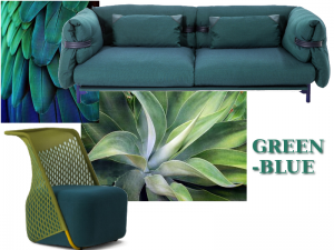
The blue-green is definitely the color range with more nuance. It was also widely used in ancient times, especially in Middle Eastern countries because it remembered at once the sky and water, the most precious commodity that had to be transported from the sea to the desert. The shades can be combined very well with nuances of red, orange and ocher yellow. The brightest version of the blue-green, which is called turquoise, goes well with the reddish hue of wood and terracotta. Along with the warm tones of reddish, it lights up any room firmly.
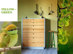
The yellow-green shades are more delicate and bright and reminiscent of the color of the leaves sprouted from buds just hatched. We can say that as chromatic gradation is the most simple to match because revives the environments in which it is inserted with freshness and discretion, not having the intensity of red and orange. The atmosphere is therefore delicate and springy.
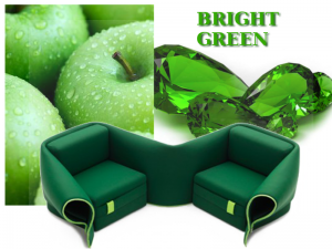
The bright green range includes the rich shades of emerald green, apple or newly sprouted grass. A historical curiosity about the bright green is that in the golden age of this shade, Napoleon issued a decree in which he established the characteristics and composition and made the prince color of his apartments, combining it with white and gold. And in fact it is right next to gold, to brilliant yellow and the more intense ocher that the color is especially striking.
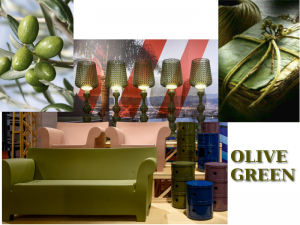
The olive green is the color of olives not yet collected: dark and dense, is the most off shades of yellow-green. The color stands out a lot next to its complement, the scarlet and the Venetian red, the Indian red and light red. It also marries perfectly to cold shades of light yellow, while with the gold receives life, reflections and movement.
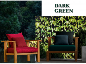
The dark green color is the color range which includes deep greens commonly defined dark bottle green and forest green and are the colors that we find in nature in holly, in the ivy and the firs. If you use the dark green to paint the walls or otherwise is abundant present in the room, it is good to illuminate well the walls to prevent the color has been so dark as to appear black. The dark green is especially striking next to the red-orange, to pink-brown, to dark or light yellow and brilliant blue.
No Comments